Available Dynamic Strings
Dynamic strings are special placeholders that automatically display real-time content such as the current year, date, site title, and logged-in username. Use them in the Customizer’s text fields to keep your site content always up to date — no manual edits needed.
Main Header Configuration Guide
The Business Interface theme offers a powerful and flexible header builder built directly into the WordPress Customizer. This guide will walk you through setting up and styling your main header.
Accessing the Header Settings
To access the header settings, navigate to Appearance → Customize in your WordPress dashboard, then go to Header → Main Header.
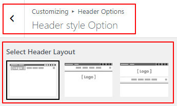
1. Header Layout Options
The theme provides predefined layout structures for your header elements (like your logo and navigation menu).
- Header 1: Standard layout with the logo on the left and the navigation menu aligned to the right.
- Header 2: Centered layout where the logo is positioned above the navigation menu.
- Header 3: Split layout with the logo on the left, navigation on the right, and additional space for widgets.
To change your layout:
- Under the Header Layout section, click on the visual representation of the layout you prefer.
- The customizer preview will update immediately.
2. Header Width
You can control how the header container aligns with the rest of your site content.
- Content Width: The header elements align with the maximum width of your site’s main content area. This is the recommended setting for boxed or standard layouts.
- Full Width: The header container stretches edge-to-edge across the screen, ideal for modern, wide-screen designs.
3. Header Widgets
Adding extra functionality to your header is easy using Header Widgets. You can add elements like a search icon or a call-to-action button.
How to add a widget:
- Scroll down to the Header Widgets section.
- You have two widget locations: Left and Right (relative to the navigation menu).
- Click the Add Widget button.
- Choose between available widgets such as Search or Button.
- Customize the widget settings (e.g., button text, link URL).
Widget Separators
If you use multiple widgets, you can add a stylish separator line between them. Under Widgets Separator, choose:
- None: No separator.
- Regular: A straight vertical line.
- Slanted: An angled separator line for a dynamic look.
Device Visibility
You can control exactly where these widgets appear. Use the Device Visibility dropdown to show widgets on all devices, or hide them specifically on mobile, tablet, or both.
4. Design & Styling Options
The Business Interface theme gives you granular control over the colors and styling of the header area.
Scroll down to the Design Options section to access these settings:
Background
Control the background of the entire header area.
- Solid Color: Choose a flat background color.
- Gradient: Create a beautiful color transition.
- Image: Upload a background image for a textured or photographic look.
Font Colors
Customize the text colors within the header:
- Tagline Color: If your site tagline is displayed in the header, change its color here.
- Link Color: The color of standard links and navigation items.
- Link Hover Color: The color links change to when a user hovers over them with their mouse.
Borders
Add definition to your header by applying borders:
- Add borders to the Top or Bottom of the header.
- Define the Style (solid, dashed, dotted), Color, and Width (in pixels).
- Separator Color: If you enabled widget separators above, you can define their exact color here.
Saving Your Changes
Once you are happy with your header configuration, click the blue Publish button at the top of the Customizer to apply the changes to your live site.
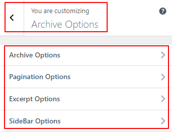
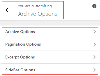
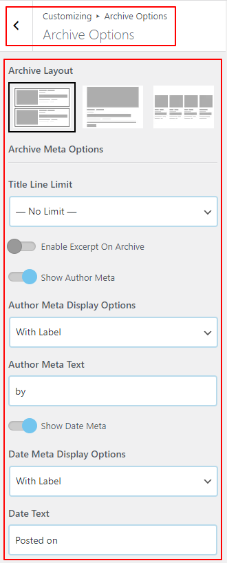
Blog and Archive Customization Guide
The Business Interface theme provides extensive options to control how your blog posts are displayed on archive pages, category pages, search results, and your main blog page.
Accessing Blog Settings
To customize your blog appearance, navigate to Appearance → Customize in your WordPress dashboard, then go to Blog → Blog Page / Archive.
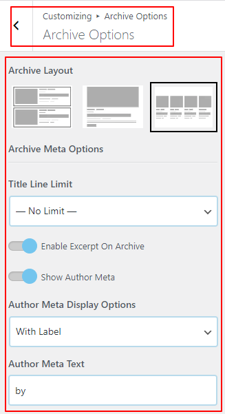
1. Blog Layout Styles
The theme offers two primary structures for displaying your post feed:
- Vertical: The traditional blog layout. The featured image is displayed at the top, followed by the title, meta information, and the post excerpt below it.
- Horizontal: A modern, list-style layout where the featured image is displayed on one side, and the post content (title, excerpt) is displayed alongside it on the other side.
When using the Horizontal layout, you get additional options:
- Show Post Categories: Display a list of categories above the post title.
- Show Read More Button: Toggle the visibility of a dedicated “Read More” button.
- Featured Image Position: Choose whether the image sits on the Left or the Right side of the content.
2. Featured Image Settings
Control how the thumbnails look across your blog feed.
Under Featured Image Size, you can select the exact dimensions the theme should use when cropping your post thumbnails. The dropdown lists all available image sizes registered on your WordPress site (e.g., Thumbnail, Medium, Large, or custom sizes). Choosing a uniform size ensures a clean, aligned grid.
3. Post Elements Visibility & Order
The Business Interface theme uses a drag-and-drop sortable interface allowing you to build the perfect post card layout.
Under Post Elements, you will see a list of items:
- Title
- Post Meta (Author, Date, etc.)
- Featured Image
- Summary (The excerpt)
- Read More (Summary footer)
How to customize:
- Reorder: Click and drag the hamburger icon next to an element to move it up or down. For example, you can drag the ‘Title’ above the ‘Featured Image’.
- Hide/Show: Click the eye icon next to an element to hide it completely from the blog feed.
(Note: The Post Elements sorter is primarily designed for the Vertical layout option).
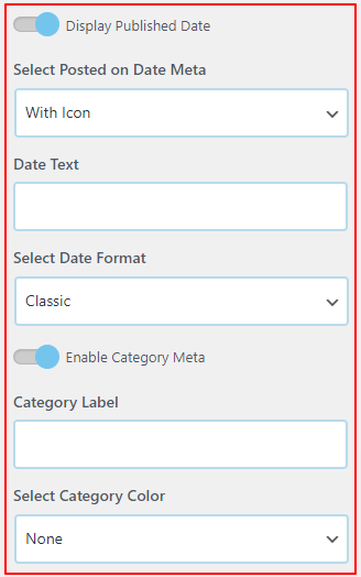
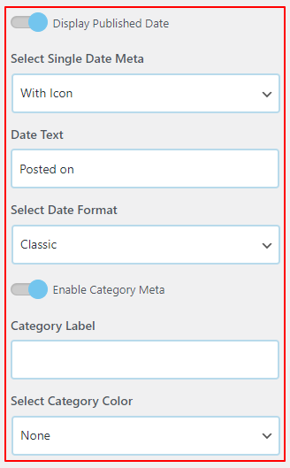
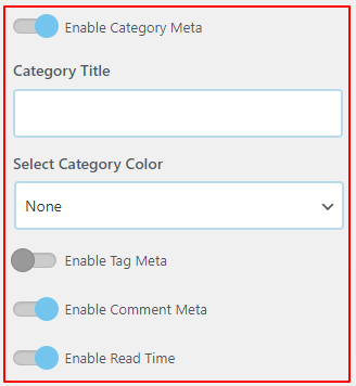
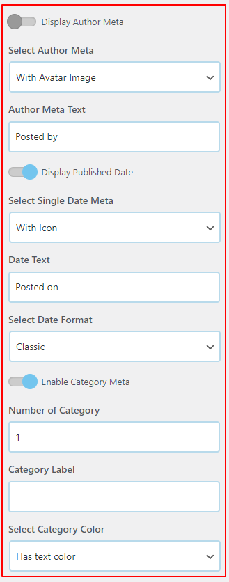
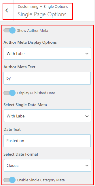
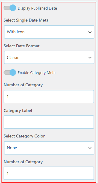
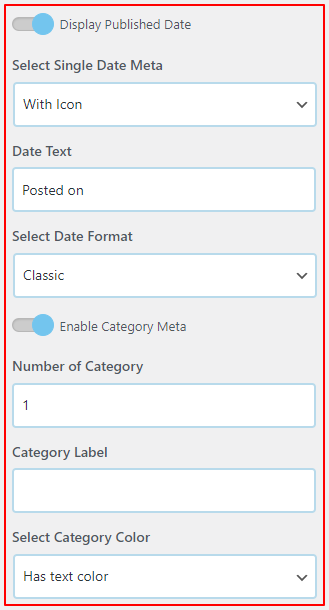
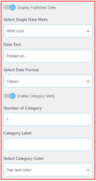
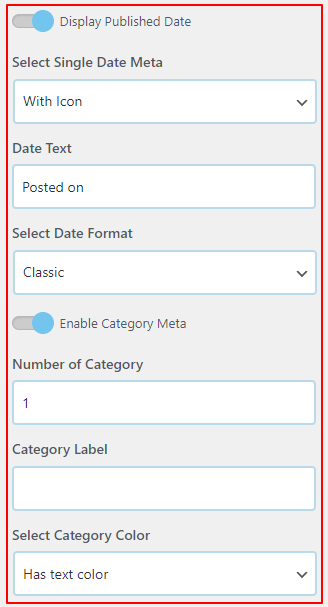
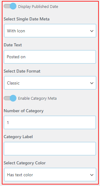
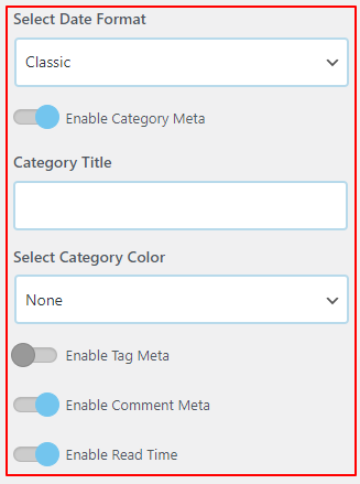
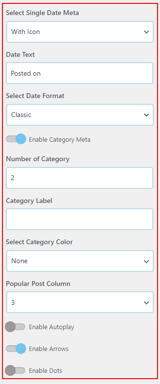
4. Post Meta Configuration
Post Meta refers to the informational details about the post, such as who wrote it and when it was published.
Under Post Meta, use the drag-and-drop sorter to organize or hide these details:
- Author
- Publish Date
- Comments count
- Categories
- Tags
Additional Meta Options:
- Show avatar and icons in post meta: Toggle this on to display the author’s profile picture (avatar) next to their name, and to show small, elegant icons next to the date, categories, and comments.
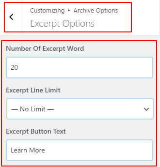
5. Excerpt Settings
Control how much text is previewed before the user has to click through to read the full article.
- Excerpt Length: Use the slider to set the maximum number of words displayed in the summary. The default is usually around 55 words, but you can increase or decrease this to fit your design.
- Excerpt More: Define the text or characters appended to the end of a cut-off excerpt. The default is usually
... or […], but you can change it to something like (continue reading).
Saving Your Changes
As you make adjustments, the live preview on the right will update to reflect your new blog design. Once you are satisfied, click the blue Publish button at the top of the Customizer to save your settings.
Global Colors & Typography Guide
The Business Interface theme makes it easy to establish your brand identity globally. Instead of changing colors and fonts on every single page, you can set global rules that apply across your entire website.
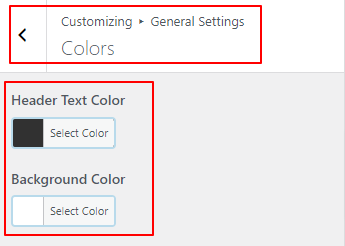
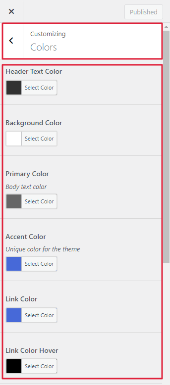
Global Colors
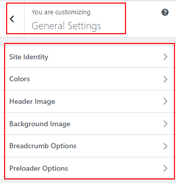
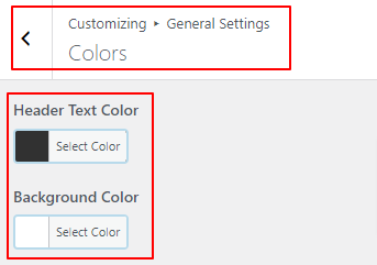
To manage your site’s color palette, navigate to Appearance → Customize in your WordPress dashboard, then go to General → Base Colors.
1. Accent Color
The Accent Color is the most important color setting on your site. It is used subtly throughout the theme to call attention to key elements, such as buttons, active menu items, and highlights. Set this to your primary brand color.
2. Content Colors
Expand the Content section to manage the colors used in the main body of your website:
- Text Color: The primary color for standard paragraph text. Usually, a dark grey (like
#333333) is best for readability.
- Link Hover Color: Defines the color that text links inside your post content change to when a user hovers over them. (Note: Standard links will automatically use your Accent Color, this setting only changes the hover state).
- Headings Color: The default color for all H1, H2, H3, H4, H5, and H6 headings across your site.
3. Boxed Content Background
If you are using a “Boxed” layout (configurable under General → Layout), you can define the Boxed Content – Background Color here. This is the color of the “paper” your text sits on, usually white or a very light grey.
Global Typography
To manage the fonts used across your site, navigate to General → Base Typography in the Customizer.
The Business Interface theme integrates seamlessly with Google Fonts, giving you access to hundreds of high-quality typefaces.
1. Base Font Size & Smoothing
- Base Font Size: This controls the
REM base of the root HTML element. Adjusting this slider will proportionally scale all typography across your entire site. The default is usually 16px.
- Font Smoothing: Enable this to apply anti-aliasing to your text, which makes fonts look crisper and more elegant, especially on Mac/iOS devices.
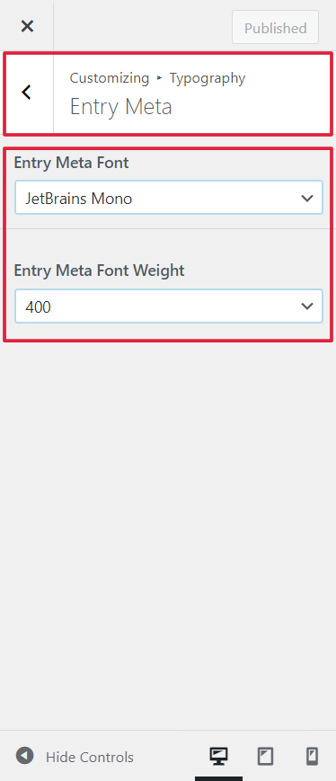
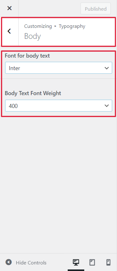
2. Body Typography
Expand the Body & Content section to set the font for all standard paragraph text.
- Click on Body Typography to choose a font family, set the font weight (e.g., 400 for normal, 700 for bold), and adjust line-height (spacing between lines of text).
3. Headings Typography
Expand the Headings (H1 – H6) section to control your title fonts.
- Headings Default: Set a global font family for all headings here. This saves time so you don’t have to select the font 6 different times.
- Specific Headings (H1 through H6): If you want to override the default for a specific heading level (for example, making your H1s much larger, or using a different font just for H3s), you can adjust them individually here.
4. Emphasized Text
- Heading Emphasized Text: The theme allows you to add special styling to
<em> tags used inside of headings. This allows you to create beautiful, magazine-style typographic elements by italicizing specific words in a title with a completely different font family (like a script or serif font).
Saving Your Changes
Once your colors and fonts are perfectly aligned with your brand, click the blue Publish button at the top of the Customizer to save your settings.
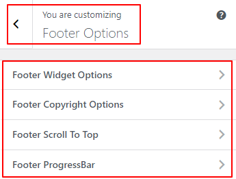
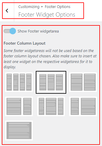
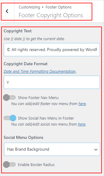
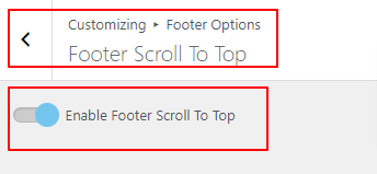
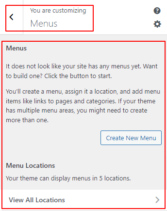
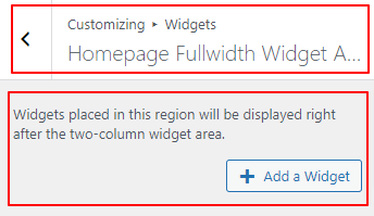
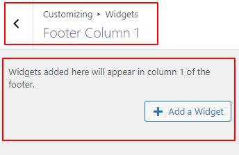
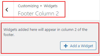
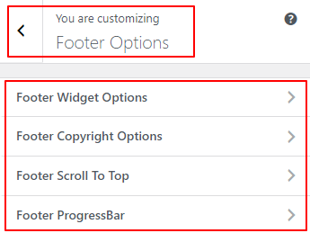
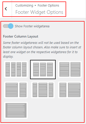
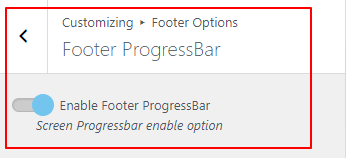
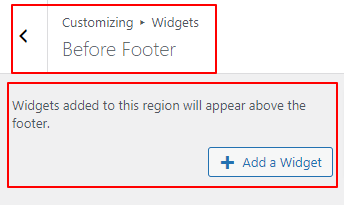
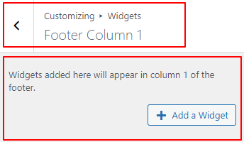
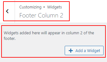
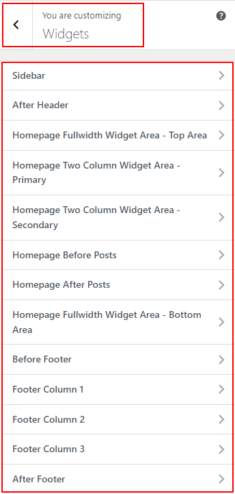
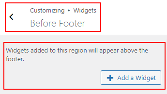
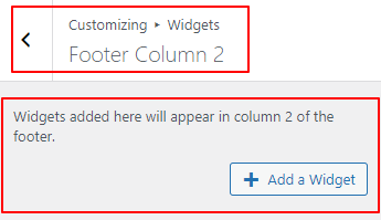
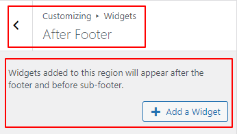
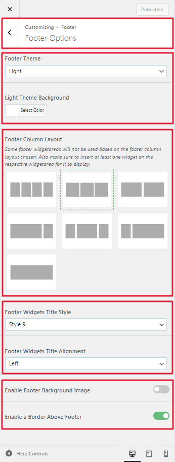
Footer Configuration Guide
Our theme offers a highly customizable footer area that you can build using WordPress widgets. This guide will help you configure the layout and styling of your site’s main footer.
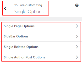
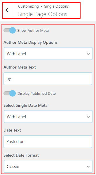
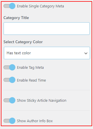
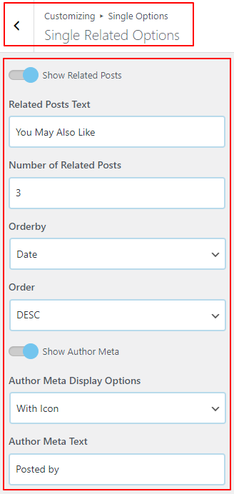
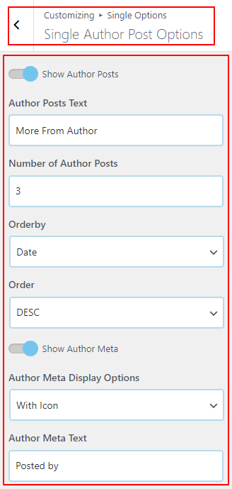
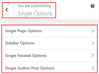
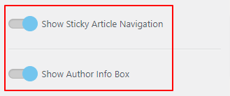
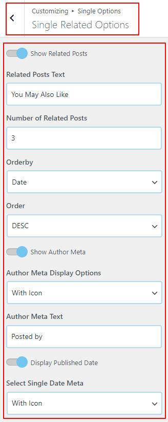
Single Post Settings Guide
Our theme gives you complete control over how individual blog posts look. From the position of the title to the ordering of meta details, you can craft the perfect reading experience.
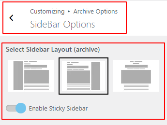
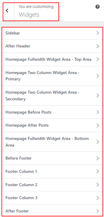
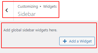
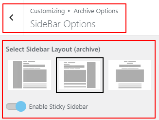
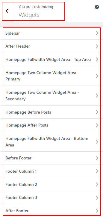
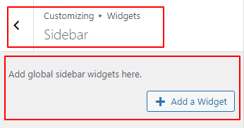
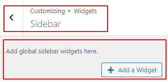
Sidebar Setup Guide
Our theme provides flexible sidebar management, allowing you to set global defaults while giving you granular control over specific post types and pages.